Adelaide as an isometric map: Light’s grid, drawn building by building
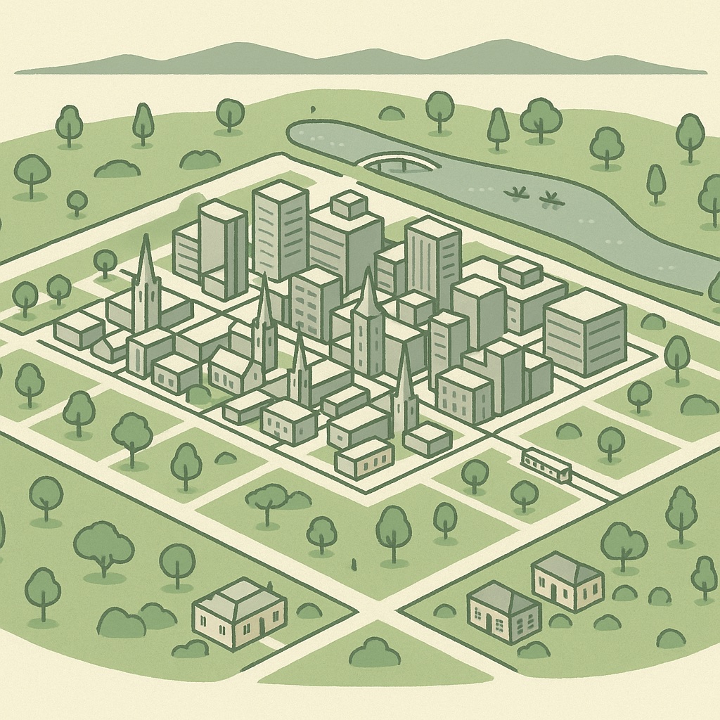
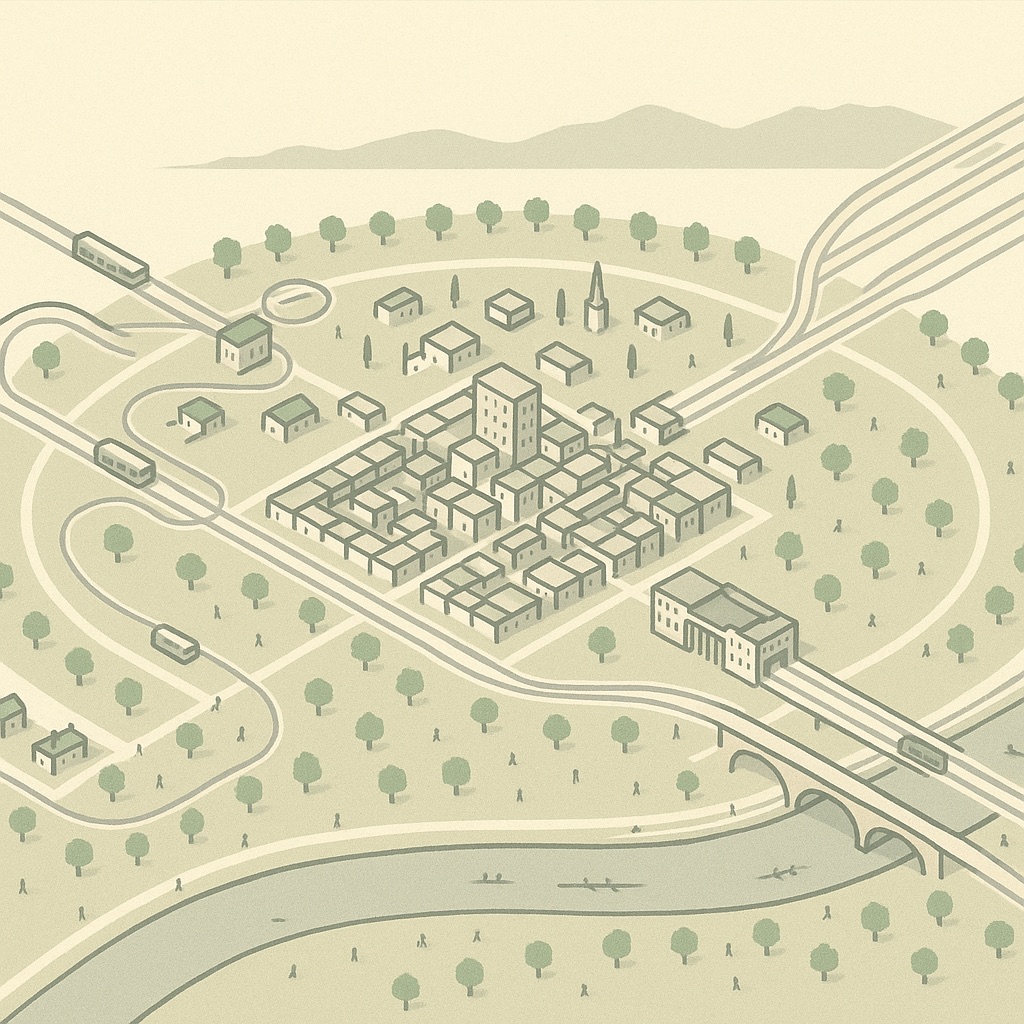
Most cities have to be tidied up before they can be drawn as a game board. Adelaide arrives pre-tidied. Colonel William Light laid the city out on paper in 1837, before there was much of a city to speak of: a rectangle of streets a mile across, a second grid for North Adelaide on the rise across the river, five public squares, and a belt of parkland wrapped around the whole thing so that the town could never quite sprawl into its own suburbs. Nearly two centuries later that plan is still the plan, which is why Pixel Adelaide looks the way it does: every block sits square on the tiles, and the green ring is exactly where Light put it.
A city that was drawn before it was built
The map is not an illustration. Each building is a box raised from its real outline in OpenStreetMap, projected into local metres, turned onto an isometric grid and painted onto a canvas in the browser, one 28-metre tile at a time. The renderer is a few thousand lines of code written for this purpose alone — no tile server, no mapping library, no imagery fetched from anyone else. It is why the map is a single page, why it keeps working once a suburb has loaded, and why it looks the same on a phone as on a large screen.
Click any building and a card opens listing what trades inside. Where an owner has claimed the card, it carries the hours, contacts and photos they supplied; everywhere else it carries whatever OpenStreetMap knows — often a full listing along the main streets of Unley and Norwood, sometimes just a name in the back streets of Thebarton.
Why nothing on this map leans
An isometric view has to choose one orientation for its two axes and then live with it. In the other cities this project has drawn, that choice always costs something: the central grid was laid out along a river or a shoreline while the suburbs were surveyed on the compass, so either the centre leans or the suburbs do. Adelaide is the exception. Light ran the square mile true north–south between North Terrace and South Terrace, East Terrace and West Terrace, and the surveyors who followed him into Unley, Prospect, Norwood and Thebarton kept the same bearings. The one deliberate departure is North Adelaide, whose grid steps slightly to follow the ridge above the Torrens, and even there the drift is small.
So the map’s axes are the city’s axes. North is up and to the right, the way it is in the strategy games this style borrows from, and King William Street runs straight up the middle of the screen from South Terrace to the river. Because every building is still drawn from its true footprint rather than snapped to the tiles, the few things that do sit askew — a church on a corner site, the railway yards, the arc of the Torrens — read as what they are, against a city that otherwise agrees with the grid.
The Park Lands, the Torrens and North Adelaide
The single most recognisable thing on the map is a shape rather than a building: the ring of Park Lands that separates the square mile and North Adelaide from every suburb around them. On the map it is drawn as parkland, with the ovals, gardens and playing fields inside it, and it does the job Light intended for it — you can tell at a glance where the city ends. The Torrens cuts through the northern half of the ring as the one flat blue line, with the weir, the footbridge to Adelaide Oval and the boathouses on its banks, and North Adelaide rises beyond it as a second, smaller grid of villas and pubs.
From footprint to building
OpenStreetMap lets a mapper record a building’s number of storeys or its height in metres, and where either exists the map uses it. That is enough to give the city its skyline: the towers along North Terrace, the hospital and university blocks at the West End, the apartment stacks that have gone up around the Central Market and along the tram line through Bowden. Where neither tag exists — most houses, most shops — the map falls back to a sensible default for the building type, so a villa is drawn as a villa, a shed as a shed and a warehouse as a low, wide box.
Roughly one Adelaide building in six has a recorded height, so the suburbs are drawn at a plausible uniform height rather than a surveyed one while the centre is close to right. If you know how many floors your building has, the fix is the one OpenStreetMap was designed for: add it there, and the next monthly refresh will pick it up.
What is on the map now, and what is not
The map launches with the layers that South Australia publishes openly and that we have checked against the ground:
- Buildings, roads, parks and the river from OpenStreetMap, with businesses placed inside the buildings they occupy.
- Public transport — the Adelaide Metro railway stations, the Glenelg tram stops and the O-Bahn interchanges, with departures from the official timetable feed.
- Schools and their zones — government schools from the Department for Education, together with the primary and high school zones the state publishes.
- Heritage — State and local heritage places from the South Australian register, shaded on the buildings they protect.
- Car parks, EV chargers, playgrounds, dog parks and the other small things a map of a city should know about.
Some layers the map draws in other cities are not here yet — anything that depends on a feed South Australia has not published in a form we can read. They will appear later if and when the data does. Nothing on the map is promised before it works.
Where the data comes from
Everything is open, and the licences are the reason the map can exist. OpenStreetMap data is under the Open Database Licence, which is why “© OpenStreetMap contributors” sits at the foot of every page and why corrections flow back: when an owner fixes a name or a phone number on a claimed card, the fix goes to OpenStreetMap rather than staying here. Government datasets — Adelaide Metro’s timetable feed, the SA Heritage Places register, the Department for Education’s school sites and zones, the ABS 2021 Census at suburb level — are used under Creative Commons Attribution and each is credited by name on the about page. The map carries no advertising and no analytics scripts.
If a building is missing, a shop is in the wrong box or a suburb boundary looks odd, fix it at the source. OpenStreetMap accepts edits from anyone, and Adelaide’s mappers have been thorough — the map you see is only ever as good as the one they keep.